Address
304 North Cardinal St.
Dorchester Center, MA 02124
Work Hours
Monday to Friday: 7AM - 7PM
Weekend: 10AM - 5PM
Address
304 North Cardinal St.
Dorchester Center, MA 02124
Work Hours
Monday to Friday: 7AM - 7PM
Weekend: 10AM - 5PM
Different grades of products can be packaged differently
So, how should we make our own characteristics in the packaging of cosmetic products? Based on many years of experience in product application and long-term psychological research on consumers, Yusu Packaging believes that the most important thing is to choose the corresponding materials and colors according to different grades.
As for the products of professional theaters, product positioning is generally based on three grades: low, medium and high. Launching personalized packaging. In terms of color and packaging materials, it is easier to be accepted by consumers.
For example, for low-end products, refill packaging can be launched, using environmentally friendly and recyclable materials. In terms of color selection, light colors such as silver, white, and pink can be used. And the material can be plastic aluminum foil.
For medium and high-end products, the material should be environmentally friendly glue, degradable glue or recycled paper. The color can be the color of kraft paper, light color, white, etc. If environmentally friendly cosmetic packaging materials are used, the product will appear more like a big brand. Due to the support of plastic lipstick shells for environmental protection, this is very helpful in improving the reputation of the brand.
Products in the daily chemical line focus more on terminal sales. Then, the packaging of the products needs to be changed.
Low-end positioning
Then, the packaging uses transparent recycled rubber or glass. Transparent materials will make the product transparent and visible. This part of consumers needs intuitive consumption guidance, so it can guide consumers’ preconceived consumption psychology, making it easier to make a deal.
High-end positioning
It needs to be made into a more mature outer packaging. The materials of these products can be made of frosted glass or ceramics. The appearance has a hazy feeling. The color of this material is white and porcelain white, which makes consumers feel classy. After buying the product, they will feel that the product is valuable.
Ultra-high-end positioning
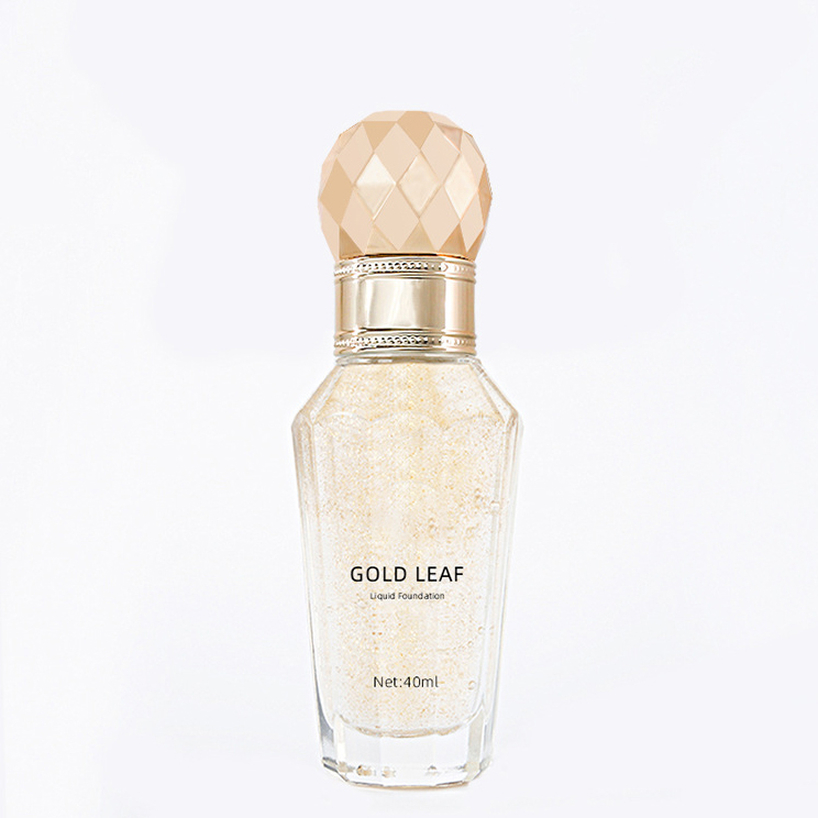
Extra-high-end products, such as some high-tech products on the market, are more targeted in quality. The price will go to more than 1,000 yuan. These products can be packaged with some materials with space effects. Such as vacuum or special packaging. The color can be gold or silver, and some paintings can be inlaid. And the material can be enamel materials, as well as cloisonné, crystal, etc. The packaging of these products can make consumers feel that this is a product of reliable quality from the appearance. Although this is just a psychological suggestion, it is enough to show that the packaging materials have indeed used such a high-value material, so the high-tech ingredients contained in it will definitely make people achieve better results.
The outer packaging design should have Chinese characteristics and advanced consciousness
Many domestic product packaging now likes to use head portraits and signatures. This was once very popular abroad. Unfortunately, it is no longer appropriate now. In fact, product packaging should not only catch up with the trend, but should surpass the trend, and should focus on fifty years later. The packaging of Chanel perfume and other perfumes we know now was designed decades ago, and now it seems that they are equally contemporary and leading the trend. For example, LANCOME has used roses as the logo of their products from the beginning. Now as long as users see the roses on the packaging, they will understand its fragrance and the ingredients it contains, which contain the essence of roses. This is worth learning for domestic companies.
In fact, what we need to do now is to use consciousness to guide consumption, not just to strengthen consumption. For example, Anna Sui is a foreign perfume brand that has been around for many years. Consumers only need to look at the outer packaging to understand that this is a sweet perfume. Its pink series of colors indicate that all girls who use this perfume brand are sweet girls.
Helena (HR) has a mascara that uses a golden outer packaging, which looks plump and slender, making it unforgettable. This kind of packaging can give consumers a psychological hint: as long as you use this product, you can get a slender and plump effect. At the same time, its quality can indeed achieve such an effect. Consumers can feel value when using such products.
Now some cosmetics containing Chinese medicine ingredients have been launched on the market. The biggest shortcoming of these products is that the outer packaging is very Westernized. In fact, since we are using the quintessence of our country – Chinese medicine products, we should use outer packaging with Chinese characteristics. For example, we can boldly use red, bright yellow, and dark blue in color.
Of course, many product packaging uses Chinese characteristics. However, many of them have failed packaging due to improper color matching, and there are many examples of this.
In fact, China has thousands of years of accumulation of color and decoration, and many elements can be applied. Since the product comes from China, the packaging should reflect Chinese characteristics, which not only makes people want to buy, but also can be collected as a souvenir after use. When foreign tourists come to China, they will also want to buy it as a souvenir, so such product packaging is successful. How to achieve this step requires industry insiders to think carefully.